7 meilleurs outils d'IA Générateur de boutique pour Shopify (2026)

L'espace générateur de boutique ai évolue rapidement, et choisir le bon générateur de boutique Shopify peut faire ou défaire le lancement de votre e-commerce. Selon Gartner, 80 % des entreprises auront utilisé des API d'IA générative ou déployé des applications activées par l'IA d'ici 2026. Que vous souhaitiez construire votre boutique ai en quelques minutes ou que vous ayez besoin d'outils de conception avancés, ces sept plateformes alimentées par l'IA apportent chacune quelque chose de différent à la table.
"L'avenir du commerce est natif de l'IA. Les commerçants qui adoptent des outils d'IA aujourd'hui ne font pas que gagner du temps - ils construisent des entreprises fondamentalement meilleures." — Harley Finkelstein, Président de Shopify
Voici notre répartition des meilleures options de générateur de boutique Shopify ai pour 2026 :
Dropmagic : Le principal générateur de boutique ai pour Shopify — générez une boutique complète et personnalisée en quelques minutes avec une copie pilotée par l'IA, un support multilingue et plus de 50 sections de conversion.
Storebuild ai : Un générateur de boutique Shopify ai axé sur une niche qui précharge 10 produits et optimise la conception pour les conversions. Lisez notre comparaison complète →
Buildyourstore ai : Même logique que ci-dessus mais plus limité. Lisez notre comparaison complète →
Shopify Magic : Suite d'IA intégrée de Shopify pour la création de contenu, la segmentation des clients et les analyses de magasin en temps réel. Lisez notre comparaison complète →
PagePilot : Crée des pages de produits et des publicités Facebook hautement convertissantes en quelques secondes — un populaire générateur de boutique Shopify pour les dropshippers. Lisez notre comparaison complète →
Shogun : Générateur de pages sans code avec des outils IA pour la conception, le référencement et les tests A/B, idéal pour la personnalisation avancée.
PageFly : Générateur glisser-déposer flexible avec plus de 120 modèles et des fonctionnalités axées sur l'optimisation des conversions.
Atlas AI Store Builder : Lance des boutiques entièrement fonctionnelles en moins de 2 minutes avec recherche de marché, outils de bundling et upsell. Lisez notre avis complet →
Vous cherchez un classement complet ? Consultez notre guide pilier Meilleurs générateurs de boutiques Shopify AI 2026.
Comparaison rapide
Outil | Focus | Temps d'installation | Caractéristiques clés | Tarification | Idéal pour |
|---|---|---|---|---|---|
Dropmagic | Automatisation complète de la boutique | Minutes | Branding IA, multilingue, 50+ sections | Essai gratuit, prix personnalisé | Automatisation et gain de temps |
Création de boutique de niche | Minutes | Produits préchargés, contenu SEO, personnalisation | Boutique gratuite, frais Shopify | Débutants testant des niches | |
Shopify Magic | Intégration Shopify | Instantané | Génération de texte/image, insights en temps réel | Inclus dans les plans Shopify | Utilisateurs Shopify existants |
PagePilot | Focus sur la conversion | Secondes | Pages produits, copie publicitaire, tests A/B | Varie selon les fonctionnalités | Dropshipping à haute conversion |
Shogun | Personnalisation avancée | Modéré | Glisser-déposer, tests A/B, optimisation mobile | Tarification par paliers | Boutiques axées sur le design |
PageFly | Flexibilité de conception | Flexible | Modèles, éditeur visuel, tests A/B | Modèle freemium | Besoins de conception personnalisés |
Atlas AI | Déploiement rapide | Moins de 2 minutes | Création de boutique à lien unique, recherche de marché, outils de bundling | 29–99 $/mois | Test de produit rapide |
Ces outils sont adaptés à différents besoins — de l'automatisation complète et de la vitesse à la conception avancée et à la personnalisation. Que vous soyez un vendeur débutant cherchant un générateur de boutique Shopify AI gratuit ou que vous développiez une entreprise existante, il y a un outil AI ici pour correspondre à vos objectifs.
Meilleurs générateurs de boutiques e-commerce AI 2026 — Principaux outils AI pour lancer votre boutique en ligne rapidement
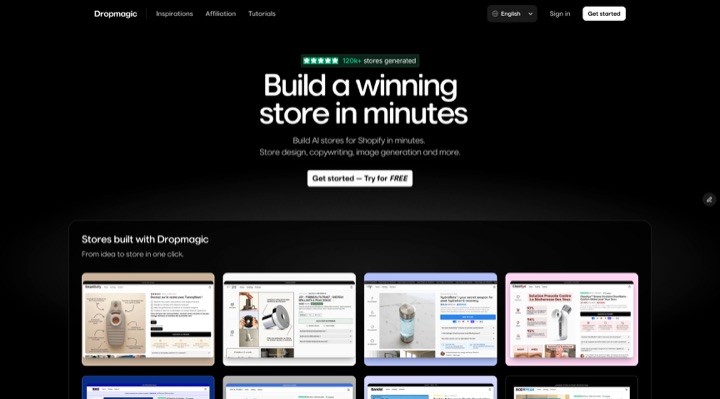
1. Dropmagic
Dropmagic est le générateur de boutique ai le plus complet pour Shopify — une plateforme alimentée par l'IA qui élimine tous les obstacles techniques entre vous et une boutique en ligne professionnelle. Plutôt que de passer des jours sur des thèmes, des copies et du branding, Dropmagic gère tout en quelques minutes. C'est rapidement devenu le générateur de boutique Shopify ai incontournable pour les entrepreneurs américains qui veulent de la rapidité sans sacrifier la qualité. Si vous vous demandez comment construire votre boutique ai en priorité, Dropmagic est la réponse.
Vitesse d'installation de la boutique
Avec Dropmagic, vous pouvez transformer une URL de produit en une boutique Shopify entièrement personnalisée en moins de cinq minutes. Selon Shopify, le marchand moyen passe 2 à 4 semaines à construire une boutique manuellement. La plateforme automatise les tâches clés comme la rédaction de descriptions de produits, la conception de mises en page de boutique, la création de branding et la génération d'images de produits. Par exemple, le 20 mai 2025, Lucas D. a partagé :
"Lancement d'une boutique complète en 12 minutes avec Dropmagic, sans toucher à un thème, écrire une copie ou installer des applications"
La plateforme prétend réduire les temps de lancement de boutique d'un facteur 10, avec plus de 2 300 boutiques déjà créées. Cette vitesse ne se fait pas au détriment de la qualité — les utilisateurs peuvent encore personnaliser leurs boutiques de manière extensive.
Options de personnalisation
Bien que l'automatisation soit une caractéristique clé, Dropmagic offre également des outils de personnalisation étendus. Les entrepreneurs peuvent choisir parmi plus de 50 sections axées sur la conversion, leur permettant d'ajuster la conception de leur boutique sans partir de zéro. Selon l'Institut Baymard, 70 % des acheteurs abandonnent les paniers en raison d'une mauvaise expérience utilisateur (UX) — les outils d'édition visuelle de Dropmagic facilitent l'ajustement des mises en page, du branding et de la présentation des produits pour maximiser les conversions. Comme l'a dit Thomas V :
"J'ai passé des semaines sur des thèmes auparavant. Dropmagic l'a fait en quelques minutes."
Ce mélange de rapidité et de flexibilité garantit que les boutiques ne se contentent pas de se lancer rapidement mais aussi de se démarquer avec un look professionnel et soigné.
Caractéristiques alimentées par l'IA
Dropmagic exploite l'IA avancée pour améliorer les performances du eCommerce. Son outil de rédaction alimenté par l'IA est formé sur des stratégies de marque réussies, tirant des enseignements d'entreprises à 8 chiffres pour créer des pages produits et des titres convaincants. Parmi les autres fonctionnalités remarquables figurent :
Importation de produits en un clic à partir de plateformes comme AliExpress, Amazon et Alibaba
Création de branding automatique
Génération de copies multilingues
Conceptions mobiles pour une expérience client fluide
Lors d'un test, Jules K. a rapporté :
"Testé A/B par rapport à mon ancien thème... Dropmagic a converti +22% mieux"
En tant que générateur de boutique Shopify, Dropmagic se démarque car il remplace une pile complète d'outils — rédaction, conception de thèmes, branding, optimisation du panier — en une seule plateforme.
Pertinence pour les entrepreneurs en eCommerce aux États-Unis
Dropmagic ne fait pas que gagner du temps — il remplace plusieurs outils, y compris ceux pour la rédaction de copies, la conception de thèmes, le branding et la gestion des paniers. Selon Statista, les ventes de eCommerce aux États-Unis devraient dépasser 1,4 trillion de dollars d'ici 2027, faisant de la rapidité le marché un avantage concurrentiel crucial. Cela réduit à la fois les coûts de mise en place et les défis opérationnels continus. Par exemple, Mehdi K. a souligné cela le 20 avril 2025 :
"J'ai testé 4 produits en une semaine avec Dropmagic, construit 4 boutiques et trouvé un gagnant"
Si vous cherchez un générateur de boutique Shopify ai gratuit pour commencer, Dropmagic offre un essai gratuit afin que vous puissiez construire ma boutique ai sans aucun engagement initial.
2. Storebuild ai
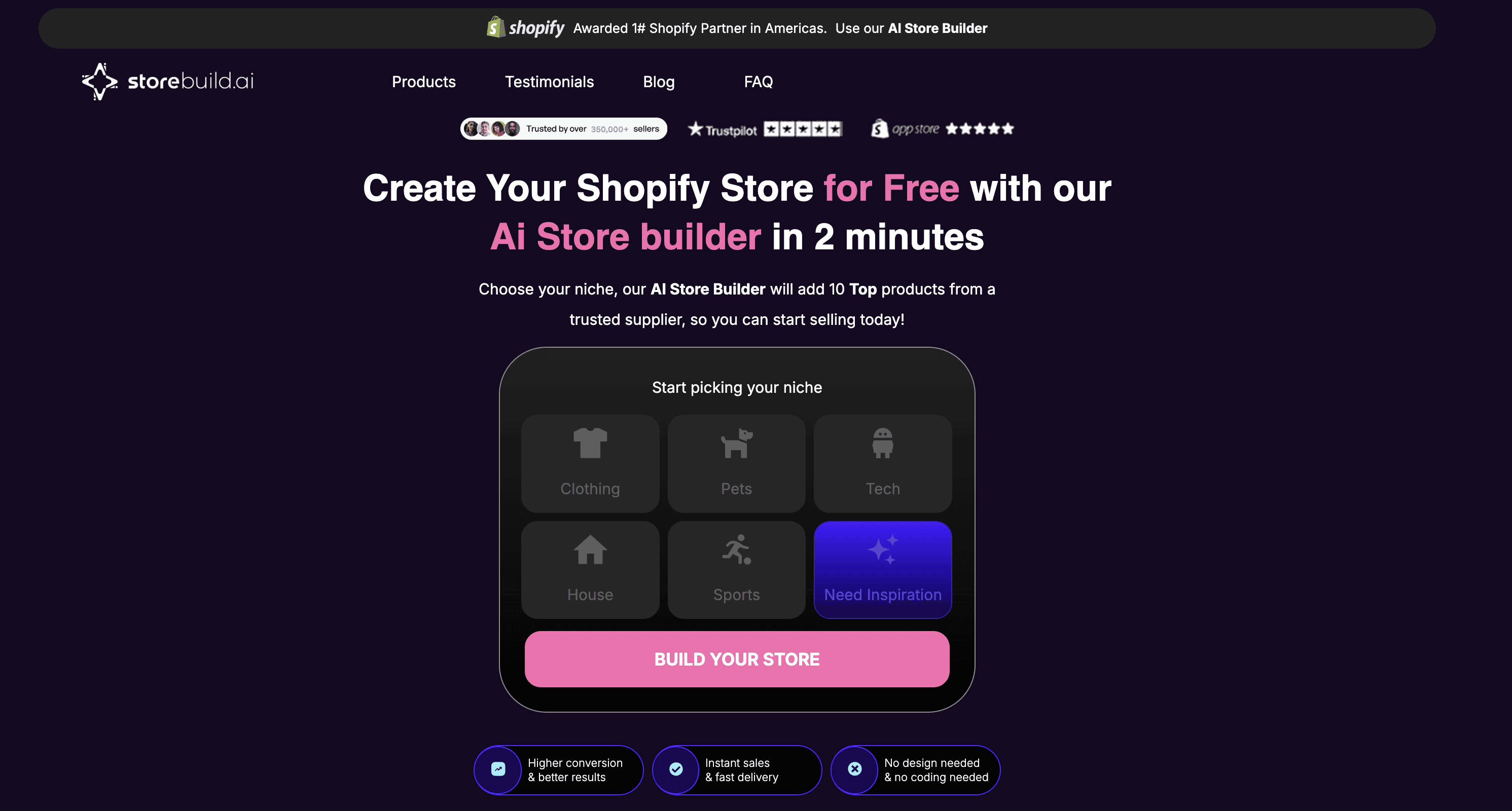
Storebuild ai est un générateur de boutique ai conçu pour les entrepreneurs cherchant à se lancer sur des marchés de niche. Il simplifie le processus en aidant les utilisateurs à sélectionner une niche puis à construire une boutique Shopify entièrement fonctionnelle en quelques minutes. Au lieu de partir de zéro, la plateforme guide les utilisateurs dans le choix d'une niche, après quoi son IA gère le travail lourd pour créer un ensemble complet de boutique.
Vous voulez une comparaison détaillée ? Lisez notre comparaison Storebuild ai vs Dropmagic.
Vitesse d'installation de la boutique
L'une des caractéristiques remarquables de Storebuild ai est la rapidité avec laquelle il installe une boutique en ligne. Après avoir sélectionné une niche, l'IA construit non seulement la boutique mais la précharge également avec 10 produits soigneusement sélectionnés, créant ainsi des opportunités de vente instantanées. Ce déploiement rapide assure aux utilisateurs de démarrer sur les chapeaux de roues, avec d'autres outils IA disponibles pour affiner et améliorer leur boutique selon les besoins.
Caractéristiques alimentées par l'IA
Storebuild ai va au-delà de la simple création d'une boutique — il utilise l'IA pour optimiser la conception et générer du contenu prêt à performer. Ses capacités IA incluent :
Curation automatique de produits : La plateforme sélectionne et charge 10 produits les plus performants adaptés à la niche choisie.
Génération de contenu optimisé pour le SEO : Elle crée des descriptions de produits qui ne sont pas seulement engageantes, mais aussi optimisées pour les moteurs de recherche, contribuant à améliorer la visibilité et les conversions.
Conception axée sur la conversion : Les utilisateurs reçoivent un thème personnalisé conçu spécifiquement pour stimuler les ventes et améliorer l'expérience utilisateur.
Options de personnalisation
Malgré son installation automatisée, Storebuild ai offre aux utilisateurs un contrôle total sur leurs boutiques. Les entrepreneurs peuvent modifier chaque aspect, de l'ajout de nouveaux produits à la personnalisation de la conception et à l'intégration d'outils supplémentaires. Cette flexibilité permet aux utilisateurs de maintenir leur identité de marque tout en bénéficiant du travail de base de l'IA. Fait important : les utilisateurs conservent 100 % de la propriété de leurs boutiques et gardent tous les bénéfices.
Pertinence pour les entrepreneurs en eCommerce aux États-Unis
Pour les entrepreneurs américains, Storebuild ai résout le défi d'entrer rapidement sur le marché. Avec plus de 228 personnes faisant leur première vente chaque jour aux États-Unis, la plateforme est particulièrement utile pour les débutants cherchant à tester et valider leurs idées rapidement. Sa grande satisfaction des utilisateurs se reflète dans une note de 4,8 étoiles sur plus de 9 000 avis sur Shopify et TrustPilot.
Le modèle de tarification est un autre atout majeur pour les entrepreneurs américains. La boutique construite par l'IA elle-même est gratuite — les utilisateurs doivent seulement couvrir les frais d'hébergement standard de Shopify. De plus, grâce à un partenariat avec Shopify, les nouveaux utilisateurs peuvent profiter d'un essai gratuit de 3 jours et ne payer que 1 $ pour leur premier mois. En tant qu'option générateur de boutique Shopify ai gratuit, c'est difficile à battre pour les débutants. La plateforme automatise l'exécution des commandes et l'approvisionnement en produits, permettant aux entrepreneurs de se concentrer sur le marketing et la croissance de leur base de clients plutôt que sur les tâches opérationnelles.
3. Shopify Magic
Shopify Magic est un ensemble d'outils gratuits alimentés par l'IA intégrés directement dans la plateforme de Shopify. En tant que fonctionnalité native de générateur de boutique Shopify ai, elle aide les marchands à gérer tout, de la construction de leur boutique et du marketing à la gestion du support client — tout cela sans dépendre de plusieurs solutions tierces.
Voyez comment il se compare : Shopify Magic vs Dropmagic comparaison complète.
Caractéristiques alimentées par l'IA
Shopify Magic apporte l'automatisation à plusieurs aspects du eCommerce. Par exemple, ses outils de génération de texte peuvent créer des descriptions de produits, des lignes d'objet de courrier électronique, des publications de blog et d'autres contenus adaptés au référencement en quelques secondes. La fonctionnalité de génération de médias permet aux marchands de supprimer ou de remplacer les arrière-plans d'image, facilitant la production de photos de produits de qualité professionnelle. De plus, avec la génération de thème, les utilisateurs peuvent concevoir des mises en page de boutique personnalisées et des blocs de thème personnalisés par simple saisie de texte.
La plateforme comprend également un assistant IA appelé Sidekick, qui fournit des insights et des recommandations en temps réel. Sidekick peut gérer des tâches techniques telles que la configuration de domaines ou la gestion des métachamps, ce qui facilite la concentration des marchands sur la croissance de leur entreprise. Ces caractéristiques simplifient non seulement la création de contenu mais accélèrent également le processus global d'installation de la boutique.
Installation plus rapide de la boutique
En automatisant les tâches répétitives, Shopify Magic accélère la mise en place d'une boutique en ligne. Les marchands peuvent générer un contenu soigné et ajuster les conceptions en un rien de temps. Le système décompose également les segments de clientèle en descriptions faciles à comprendre et fournit des résumés des avis sur les applications, aidant les marchands à choisir les bons outils pour leur boutique. Cette efficacité s'harmonise parfaitement avec l'objectif plus large de Shopify de rationaliser les opérations de eCommerce.
Personnalisation flexible
Bien que Shopify Magic automatise de nombreux processus, il permet également la personnalisation. Les marchands peuvent éditer le contenu généré par l'IA pour qu'il corresponde au ton et au style de leur marque. L'éditeur de thèmes intégré et les outils de texte axés sur les mots-clés offrent des options supplémentaires pour affiner les conceptions et améliorer le SEO, donnant aux entreprises la flexibilité de se démarquer.
Un atout pour les entrepreneurs en eCommerce aux États-Unis
Shopify Magic est particulièrement bien adapté pour les marchands basés aux États-Unis. Il est par défaut en anglais américain et s'appuie sur les données linguistiques d'Amérique du Nord pour garantir que le contenu se connecte avec les clients américains. Prenons l'exemple de Klatch Coffee — une torréfaction familiale qui est passée à Shopify pour profiter de ces outils IA. En automatisant les tâches quotidiennes, ils ont pu se concentrer davantage sur la croissance stratégique.
Cependant, Shopify Magic fonctionne mieux en tant qu'ajout à un plan Shopify existant plutôt qu'en tant que générateur de boutique ai autonome. Si vous avez besoin d'un outil qui génère une boutique complète dès le début — thème, copie, branding, et tout — un générateur de boutique Shopify dédié comme Dropmagic pourrait être un meilleur choix.
4. PagePilot
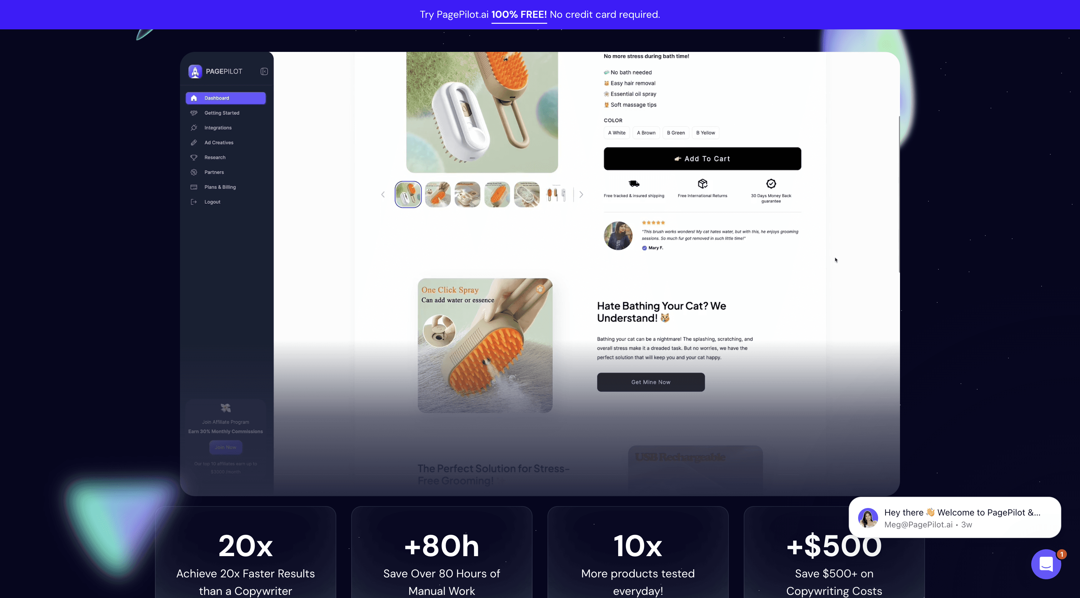
PagePilot est un générateur de boutique Shopify alimenté par l'IA conçu pour créer des pages produits et des publicités Facebook à haute conversion directement à partir de liens produits AliExpress ou Shopify.
Lire l'analyse complète : comparaison PagePilot vs Dropmagic.
Vitesse d'installation de la boutique
Avec PagePilot, vous pouvez publier une page produit en seulement 60 secondes. Comparez cela aux environ 3 heures nécessaires pour le faire manuellement, et vous économisez plus de 80 heures tout en réduisant les coûts de rédaction de 50 $ à seulement 0,78 $ par page produit.
"J'ai pu lancer ma boutique en une journée et tester plusieurs produits rapidement pendant que mes concurrents travaillent encore sur leur site web. Le meilleur générateur de boutique Shopify AI." – Vinish P.
Cet avantage en termes de vitesse s'associe parfaitement à ses fonctionnalités avancées en IA.
Caractéristiques alimentées par l'IA
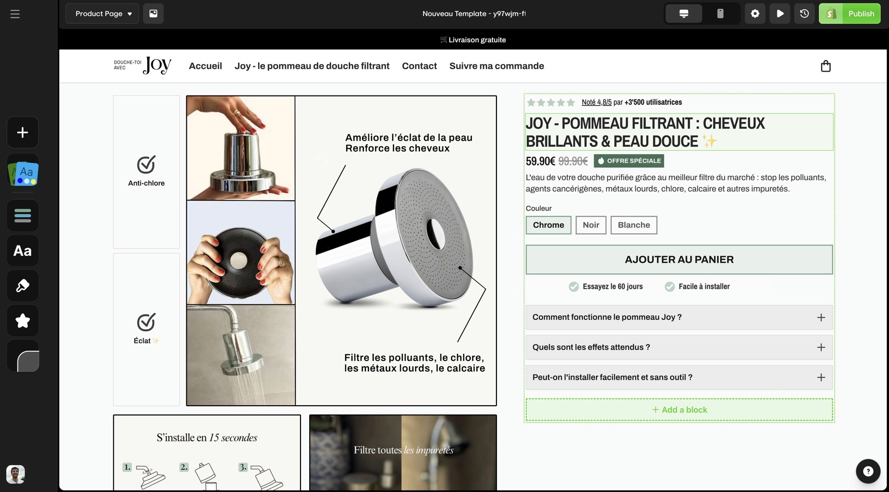
PagePilot utilise l'IA pour automatiser la création de contenu et optimiser les informations produits à partir de liens AliExpress ou Shopify. Il construit des pages détaillées et axées sur les ventes comprenant des avis, des variantes de produits, des garanties et des images optimisées. La plateforme applique des techniques de rédaction éprouvées pour créer des descriptions de produits engageantes et des textes publicitaires pour Facebook qui conduisent à des résultats. L'une des fonctionnalités remarquables est l'importation en un clic vers les boutiques Shopify, qui vous permet d'ajouter instantanément la page produit générée — sans formatage supplémentaire nécessaire.
Options de personnalisation
PagePilot prend en charge la personnalisation en générant des pages produits en plus de 30 langues. Il offre également des polices et des styles ajustables pour correspondre aux préférences spécifiques des audiences américaines.
Pertinence pour les entrepreneurs en eCommerce aux États-Unis
Pour les entrepreneurs aux États-Unis, PagePilot est un choix populaire. Selon WordStream, le taux de conversion moyen des publicités Facebook à travers les industries est de 9,21 %, mais des pages produits bien optimisées peuvent augmenter ce chiffre de manière significative. PagePilot vous permet de tester plusieurs produits dans le temps qu'il faudrait normalement pour créer une seule page produit.
"PagePilot.ai a transformé mon entreprise ! Mes ventes ont grimpé en flèche avec ses pages à haute conversion. Cet outil est indispensable pour tout dropshipper." – Anthony Eclipse
Cela dit, PagePilot se concentre sur les pages produits individuelles plutôt que sur la création complète de boutiques. Si vous souhaitez un générateur de boutique ai complet qui gère tout, du branding à la mise en page de la boutique, consultez comment PagePilot se compare à Dropmagic.
5. Shogun
Shogun est un constructeur de pages sans code conçu pour les grandes plateformes eCommerce. Avec son interface glisser-déposer et ses outils alimentés par l'IA — comme AI Text, Designer, SEO et Elements — il permet aux utilisateurs de créer des pages de boutique à haute conversion sans avoir besoin d'une expertise technique. Bien qu'il ne soit pas un générateur de boutique ai complet au même sens que Dropmagic ou Atlas, c'est un outil de conception puissant pour les marchands qui veulent un contrôle granulaire.
Caractéristiques alimentées par l'IA
En septembre 2023, Shogun a introduit quatre outils IA pour simplifier la création de contenu. AI Text aide à générer des copies optimisées pour les pages produits et d'atterrissage, tandis que AI Designer transforme des demandes simples en sections de pages web. L'outil AI SEO crée automatiquement des titres et descriptions méta, et AI Elements crée du code personnalisé pour des composants interactifs.
"Vous pouvez maintenant générer du contenu — depuis le texte de votre boutique jusqu'à des sections de pages complètes — instantanément. Désormais, vous n'avez plus besoin de commencer à partir d'une page blanche." – Bill Farrell, Directeur principal de la gestion des produits chez Shogun
De plus, Shogun Insights fournit des conseils en temps réel pour améliorer les conversions et la conception, permettant aux marchands de prédire comment leur contenu va performer sans tests externes. Ces fonctionnalités simplifient et rendent efficace la personnalisation.
Options de personnalisation
L'éditeur glisser-déposer de Shogun facilite l'ajout d'images, de vidéos, de boutons et de formulaires, tout en vous permettant d'ajuster les polices, les couleurs et les mises en page pour correspondre à votre marque. Des modèles pré-construits sont disponibles comme point de départ pour une personnalisation plus poussée.
La plateforme prend également en charge la personnalisation avancée, vous permettant d'adapter le contenu pour différents segments d'audience. Les entreprises ont constaté des résultats tangibles avec ces fonctionnalités. Par exemple, LogoJET Inc. a utilisé Shogun pour créer des pages personnalisées au-delà des modèles par défaut de Shopify.
Vitesse d'installation de la boutique
Shogun élimine la frustration de commencer à partir de zéro en permettant aux utilisateurs de générer instantanément des sections de pages complètes avec ses outils IA. La fonctionnalité glisser-déposer accélère encore le processus, permettant aux utilisateurs de créer des pages professionnelles beaucoup plus rapidement que le codage traditionnel.
Pertinence pour les entrepreneurs en eCommerce aux États-Unis
Pour les entrepreneurs américains, Shogun offre des avantages uniques. C'est le seul constructeur de pages à avoir le statut certifié Shopify Plus, en faisant un excellent choix pour les entreprises en croissance. Selon Insider Intelligence, le commerce mobile représente plus de 44 % des ventes eCommerce aux États-Unis, rendant les fonctionnalités d'optimisation mobile de Shogun particulièrement vitales.
Les entreprises utilisant des pages d'atterrissage personnalisées signalent des taux de conversion jusqu'à 40 % plus élevés que celles s'appuyant sur des modèles standards. Certains utilisateurs de Shogun ont réalisé jusqu'à 15 % d'augmentation des conversions grâce aux tests A/B.
"En matière d'expansion stratégique du commerce électronique, vous avez besoin de solutions qui peuvent gérer la complexité." – Finbarr Taylor, Co-fondateur et CTO de Shogun
Shogun reçoit constamment des notes élevées de la part des utilisateurs, avec des avis Capterra atteignant en moyenne 4,8/5 étoiles.
6. PageFly
PageFly est un générateur de boutique Shopify glisser-déposer conçu spécialement pour les boutiques Shopify, approuvé par plus de 200 000 marchands dans le monde entier. Son principal objectif est l'optimisation du taux de conversion (CRO) et l'offre d'outils de conception flexibles, facilitant la création par les entrepreneurs de pages d'atterrissage personnalisées, de pages produits et de pages d'accueil — sans codage requis.
Options de personnalisation
L'éditeur de PageFly vous donne un contrôle total sur vos conceptions de pages. Vous pouvez ajuster chaque détail, des mises en page au style avancé, pour vous intégrer de manière transparente à la plupart des thèmes Shopify, le tout sans altérer vos actifs de thème de base. Avec plus de 120 modèles et une compatibilité avec plus de 130 applications, cela offre de nombreux outils pour vous aider à construire une boutique en ligne remarquable.
Ce qui distingue PageFly, c'est sa capacité à créer des pages avec des éléments entièrement personnalisables, allant au-delà des options de conception habituelles de Shopify. Cette flexibilité a conduit à des résultats tangibles pour de nombreux utilisateurs. Craig Hume, Directeur général de Utopia Computers, a partagé :
"PageFly a été un élément crucial pour notre présence en ligne."
Amaury Abel-Smith, Propriétaire de Lock Feet, a également loué la plateforme :
"PageFly m'a fourni toutes les ressources pour créer un site web vraiment beau qui génère plus de ventes."
Vitesse d'installation de la boutique
PageFly n'offre pas seulement une personnalisation — il accélère également l'ensemble du processus de mise en place de la boutique. Ses modèles pré-conçus et son interface glisser-déposer facilitent la création rapidement de pages à l'aspect professionnel. Vous pouvez mettre en œuvre des modifications en temps réel, évitant les délais souvent associés au développement personnalisé.
Pourquoi c'est important pour les entrepreneurs en eCommerce aux États-Unis
Pour les entrepreneurs basés aux États-Unis, la combinaison de flexibilité de conception et de rapidité de PageFly est un atout majeur. La plateforme offre un support client 24/7 et des outils de test A/B, permettant aux utilisateurs de réaliser des améliorations fondées sur les données à leurs boutiques. Avec une réputation exemplaire - affichant une note de 4,9/5 sur le Shopify App Store et un score de 4,8/5 sur Trustpilot - PageFly est connue pour sa facilité d'utilisation et ses puissantes fonctionnalités de conception.
La tarification est simple : il y a un plan gratuit (une page publiée) et des options payantes allant de 24 $/mois (jusqu'à 5 pages) à 99 $/mois (pages illimitées). Notez que PageFly est un générateur de pages, pas un générateur de boutique ai complet - il ne générera pas votre branding, votre copie ou vos importations de produits automatiquement comme le fait un générateur de boutique Shopify ai dédié comme Dropmagic.
7. Atlas AI Store Builder
Le générateur de boutique AI Atlas est un générateur de boutique Shopify alimenté par l'IA qui simplifie la création de boutique comme jamais auparavant. Avec plus de 45 234 boutiques lancées et plus de 22 273 566 $ de ventes utilisateurs, c'est un acteur sérieux dans l'espace générateur de boutique ai.
Lisez notre avis détaillé du générateur de boutique AI Atlas.
Caractéristiques alimentées par l'IA
Le générateur de boutique AI Atlas pousse la création de boutique automatisée au niveau supérieur. Il peut créer une boutique Shopify entièrement fonctionnelle à partir d'un seul lien produit — que ce soit d'AliExpress, Amazon, Alibaba, ou Shopify lui-même. Au-delà de la simple création de la boutique, l'IA s'occupe de la recherche de marché, génère des descriptions produits de qualité professionnelle, et élabore une copie persuasive conçue pour convertir les visiteurs en acheteurs. Elle produit même des photos de produits de haute qualité, éliminant le besoin de travaux de conception coûteux. Le générateur de boutique atlas.ai comprend également des outils de bundling et de vente incitative intégrés pour aider à augmenter les valeurs moyennes des commandes.
Vitesse d'installation de la boutique
La vitesse est l'une des qualités remarquables du générateur de boutique AI Atlas. La plateforme peut construire une boutique Shopify complète en une moyenne de seulement 1 minute et 57 secondes. Cette installation ultra-rapide permet aux entrepreneurs de tester rapidement de nouvelles idées de produits et de lancer des boutiques sans délai, ce qui est parfait pour ceux qui souhaitent valider des concepts en un temps record.
Options de personnalisation
Bien que l'automatisation soit au cœur du générateur de boutique AI Atlas, elle ne manque pas de personnalisation. Les utilisateurs peuvent choisir parmi plus de 30 sections et widgets de thème personnalisables, leur donnant la possibilité d'ajuster les noms de boutiques, les titres de produits, les prix, les évaluations, et les descriptions pour correspondre à leur identité de marque. Une fois la boutique générée, elle reste entièrement modifiable dans Shopify, permettant des changements de texte, de couleurs, de dispositions, et plus encore. Leur thème premium "Bolt" est bien conçu et sert de base flexible.
Pertinence pour les entrepreneurs en eCommerce aux États-Unis
Le générateur de boutique AI Atlas est particulièrement adapté aux entrepreneurs aux États-Unis, adressant des défis clés tels que la nécessité d'une entrée rapide sur le marché et les coûts élevés d'embauche de freelances pour la conception et la rédaction. En combinant plusieurs fonctions en une seule plateforme, il peut aider à économiser des coûts significatifs par lancement de boutique. Son intégration transparente avec Shopify assure une expérience utilisateur fluide, et sa forte réputation se reflète dans une note de 4,6/5 sur le Shopify App Store, avec 89 % des utilisateurs lui attribuant 5 étoiles.
La tarification est simple : 29 $/mois pour 50 crédits (Basic), 49 $/mois pour 150 crédits (Pro), et 99 $/mois pour 450 crédits (Expert). La génération de boutique utilise 10 crédits, tandis que la création de pages produits individuelles coûte 2 crédits chacune. Pour un regard plus approfondi sur la manière dont Atlas se compare, lisez notre analyse Atlas AI vs Dropmagic.
Comparaison des caractéristiques et des prix
Voici un aperçu rapide de la façon dont ces outils de générateur de boutique ai se comparent en termes de fonctionnalités, de temps d'installation et de prix :
Outil | Focus principal | Temps d'installation | Caractéristiques clés | Tarification | Idéal pour |
|---|---|---|---|---|---|
Dropmagic | Automatisation complète de la boutique | Minutes | Rédaction IA, 50+ sections de conversion, support multilingue, branding instantané | Essai gratuit disponible, prix sur demande | Entrepreneurs cherchant une automatisation complète |
Création de boutique alimentée par l'IA | Installation rapide | Création de boutique automatisée, importation de produits, personnalisation de base | Prix personnalisé | Lancements de boutiques rapides | |
Shopify Magic | Intégration native Shopify | Instantané | Outils AI intégrés, flux de travail transparent, optimisation automatique | Inclus dans les plans Shopify | Utilisateurs Shopify actuels |
PagePilot | Optimisation des pages | Mise en œuvre rapide | Création de pages d'atterrissage, optimisation de la conversion, tests A/B | Le prix varie selon les fonctionnalités | Boutiques axées sur les taux de conversion |
Shogun | Personnalisation avancée | Temps d'installation modéré | Générateur glisser-déposer, tests A/B, contrôles détaillés de conception | Structure de prix par paliers | Boutiques axées sur le design |
PageFly | Flexibilité de conception | Installation flexible | Modèles étendus, éditeur visuel, optimisation mobile | Modèle freemium | Besoins de conception personnalisés |
Atlas AI Store Builder | Déploiement ultra-rapide | Moins de 2 minutes | Création de boutique à lien unique, recherche de marché, outils de bundling | 29–99 $/mois | Test et validation rapides |
Ce tableau met en évidence les différences en termes de rapidité, personnalisation, et coût, vous aidant à choisir le générateur de boutique Shopify ai qui correspond le mieux à vos objectifs commerciaux.
Si la vitesse est votre priorité, le générateur de boutique AI Atlas se distingue avec un temps d'installation inférieur à deux minutes, parfait pour les entreprises nécessitant un test rapide. De même, Dropmagic propose un processus de déploiement rapide, ne prenant que quelques minutes. En revanche, des outils comme Shogun et PageFly s'adressent aux utilisateurs ayant besoin d'une personnalisation avancée, offrant des générateurs glisser-déposer et une flexibilité de conception étendue pour des marques et des mises en page uniques. Pour les entrepreneurs qui préfèrent l'automatisation avec une personnalisation essentielle, Dropmagic et Atlas AI fournissent des éditeurs intégrés qui équilibrent facilité d'utilisation et fonctionnalité.
En ce qui concerne les prix, Dropmagic propose un essai gratuit — en faisan un générateur de boutique Shopify ai gratuit à essayer — tandis que Shopify Magic inclut ses fonctionnalités AI dans les plans Shopify existants, simplifiant le coût pour les utilisateurs actuels. Pour les entreprises basées aux États-Unis, l'intégration native de Shopify rationalise les aspects cruciaux tels que la devise, les taxes, et la configuration des expéditions.
La facilité d'utilisation varie beaucoup. Les plateformes entièrement automatisées comme Dropmagic et Atlas AI nécessitent peu de savoir-faire technique, ce qui les rend idéales pour les solopreneurs ou les petites équipes. En revanche, des outils comme Shogun exigent plus d'expertise en conception mais récompensent les utilisateurs par un contrôle accru sur le produit final.
Chaque outil apporte des atouts uniques à la table. Les 50+ sections axées sur la conversion de Dropmagic et son support multilingue sont parfaits pour les entreprises visant à atteindre des audiences mondiales, tandis que les outils de bundling de Atlas AI aident à augmenter les revenus par client. En fin de compte, le bon générateur de boutique Shopify dépend de vos besoins spécifiques et du niveau de personnalisation et d'automatisation requis par votre entreprise.
Toujours indécis ? Notre guide Meilleurs générateurs de boutiques Shopify AI 2026 classe chaque outil côte à côte avec un tableau de comparaison détaillé.
Dernières réflexions
Les données parlent d'elles-mêmes : selon McKinsey, 60 % des petites entreprises utilisant l'IA ou l'automatisation déclarent gagner du temps et travailler plus efficacement, tandis que les entreprises tirant parti de l'IA ont vu une augmentation moyenne de 10–12 % de leurs revenus.
La montée des solutions e-commerce alimentées par l'IA fait partie d'un changement plus vaste. Selon IBM, en 2024, 40 % des petites entreprises ont déclaré utiliser l'IA générative — presque le double de l'année précédente. Cette adoption rapide est alimentée par des avantages clairs et mesurables.
L'impact est évident dans des exemples pratiques. Un détaillant de meubles utilisant PaLM 2 de Google Cloud a réduit sa charge de travail de création de contenu jusqu'à 75 %, constaté une amélioration de 25 % de la visibilité des produits, et connu une hausse de 20 % des taux de conversion (Études de cas Google Cloud). De même, le passage de DoggieLawn de Magento à Shopify Plus, alimenté par l'IA, a entraîné une augmentation de 33 % des conversions d'ici 2025.
D'autres histoires de réussite mettent en lumière comment l'IA redéfinit l'e-commerce. Le quiz de correspondance de teinte piloté par l'IA d'Ilia a attiré une liste d'attente de 55 000 acheteurs avant un lancement de produit, tandis qu'Olive & Piper a utilisé la personnalisation basée sur l'IA pour atteindre une augmentation de 35 % des conversions pendant les saisons de shopping de pointe. Ces exemples montrent comment le bon générateur de boutique ai peut se traduire directement par une croissance commerciale.
"Automatisez ce qui peut être automatisé. N'ayez pas peur de tirer parti des outils d'IA génératrice pour aider à faire les choses plus efficacement et efficacement. Rappelez-vous que le temps de votre équipe est précieux ; concentrez-vous sur ce pour quoi vous êtes exclusivement qualifié et externalisez le reste." — Steven Gmelin, VP des Ventes numériques et de la Stratégie chez ALOHA
Les outils IA donnent désormais aux petites entreprises l'accès à des capacités autrefois réservées aux grandes entreprises. De la tarification dynamique à la gestion des stocks, ces outils sont des facteurs de changement. Selon la Harvard Business Review, les entreprises utilisant des analyses prédictives ont signalé jusqu'à 75 % de réduction des ruptures de stock et une baisse de 20 % des coûts de stockage.
Pour les entrepreneurs américains, l'avantage concurrentiel est indéniable. Selon Accenture, l'IA devrait augmenter la rentabilité de 59 % d'ici 2035, et l'automatisation pilotée par l'IA pourrait augmenter la rentabilité de l'e-commerce de 15 à 20 % d'ici 2030. Les premiers adopteurs qui investissent dans le bon générateur de boutique Shopify se positionnent pour un succès à long terme. Si vous souhaitez construire votre boutique ai, les outils discutés ici ne sont que le début de ce que l'IA peut faire pour les entrepreneurs ambitieux.
Chris Wlezien, Fondateur & Stratège en innovation de produit chez Eureka Partners, offre ce conseil :
"Permettez-vous la liberté et la flexibilité d'essayer divers outils régulièrement, et donnez-vous le temps d'apprendre à les utiliser et même parfois à échouer. Les outils IA sont créés si rapidement et ont tant de pouvoir mais aussi de nombreux inconvénients, qui sont difficiles à anticiper, donc expérimenter et vous permettre d'être curieux et d'essayer une variété d'outils est vraiment la base pour réussir dans ce paysage en rapide évolution."
Avec certains outils IA à partir de moins de 200 $ par mois, les petites entreprises aux États-Unis peuvent tester et intégrer rapidement ces technologies sans coûts initiaux importants. Cette faible barrière à l'entrée, combinée aux gains d'efficacité et de performance, fait d'un générateur de boutique ai un allié accessible et puissant pour les entrepreneurs cherchant à développer leurs opérations.
FAQs
Qu'est-ce qu'un générateur de boutique AI et comment aide-t-il avec l'e-commerce ?
Un générateur de boutique ai est une plateforme qui utilise l'intelligence artificielle pour automatiser le processus de création d'une boutique en ligne — de la génération de descriptions de produits et de branding à la conception de mises en page et à l'optimisation pour les conversions. Selon Shopify, les marchands utilisant des outils IA lancent des boutiques jusqu'à 10 fois plus rapidement que ceux qui construisent manuellement. Plutôt que de passer des semaines à bâtir un thème générateur de boutique Shopify, ces outils vous permettent de lancer une boutique professionnelle en quelques minutes. Ils sont particulièrement utiles pour les dropshippers et les entrepreneurs en solo qui souhaitent tester des produits rapidement sans embaucher de designers ou de rédacteurs.
Que dois-je rechercher lors du choix d'un générateur de boutique Shopify AI ?
Lors du choix d'un générateur de boutique Shopify ai, commencez par vous assurer qu'il fonctionne bien avec votre plateforme et vos outils actuels. Une intégration fluide peut vous faire gagner du temps et éviter des maux de tête à l'avenir. Vous voudrez également choisir un outil capable de croître avec votre entreprise — que cela signifie gérer plus de trafic, traiter plus de volumes de transactions, ou étendre d'autres opérations.
Prenez en compte des fonctionnalités qui peuvent simplifier votre charge de travail, comme le téléchargement automatique de produits, les outils de marketing et les options de support client. Si vous êtes nouveau dans l'IA, privilégiez les outils faciles à utiliser et ne nécessitant pas une courbe d'apprentissage raide. Selon la NNGroup, les pages qui se chargent en moins de 3 secondes voient des taux de rebond inférieurs de 53 % — vérifiez donc que votre générateur produit des boutiques à chargement rapide. Le bon générateur de boutique ai peut rendre le processus de construction de votre boutique plus fluide et vous préparer au succès à mesure que votre entreprise se développe.
Existe-t-il un générateur de boutique Shopify AI gratuit avec lequel je peux commencer ?
Oui — plusieurs plateformes offrent des essais gratuits ou des niveaux gratuits. Dropmagic est un générateur de boutique Shopify ai gratuit à essayer avec son essai gratuit, vous permettant de construire votre boutique ai avant de vous engager. Storebuild ai offre également une option générateur de boutique ai gratuit où la boutique construite par l'IA elle-même est gratuite et vous ne payez que les frais d'hébergement standard de Shopify. Shopify Magic est inclus sans coût supplémentaire avec tout plan Shopify. L'essentiel est de commencer à construire, de tester ce qui fonctionne, et de mettre à niveau à mesure que votre entreprise grandit.
Comment le générateur de boutique Atlas AI se compare-t-il à Dropmagic ?
Le générateur de boutique AI Atlas se concentre sur le déploiement ultra-rapide — créant une boutique Shopify complète en moins de 2 minutes à partir d'un simple lien produit. Il est idéal pour le test rapide de produits avec des outils de bundling et de vente incitative intégrés. Dropmagic adopte une approche plus complète, générant un branding complet, des copies pilotées par l'IA formées sur des stratégies de marque à 8 chiffres, et 50+ sections de conversion. Pour une comparaison détaillée, consultez notre comparaison Atlas AI vs Dropmagic et notre avis complet sur le générateur de boutique AI Atlas.
Puis-je construire ma boutique alimentée par l'IA si je n'ai aucune compétence technique ?
Absolument. L'objectif d'un générateur de boutique ai est de supprimer la barrière technique. Les plateformes comme Dropmagic et le générateur de boutique AI Atlas ne nécessitent aucune connaissance en codage — vous fournissez simplement une URL de produit ou choisissez une niche, et l'IA génère tout, du branding et des descriptions de produits à la mise en page de la boutique. Selon Grand View Research, le marché des outils AI sans code connaît une croissance de 28,1 % CAGR, stimulée par la demande des entrepreneurs non techniques. Si vous souhaitez construire ma boutique ai en premier, ces outils le rendent possible en quelques minutes.
Quel est le meilleur générateur de boutique AI pour les débutants en dropshipping ?
Pour les débutants, le meilleur générateur de boutique Shopify ai dépend de votre budget et de vos objectifs. Si vous voulez une option entièrement générateur de boutique ai gratuit pour commencer, Storebuild ai vous permet de créer une boutique sans coût au-delà des frais Shopify. Pour un lancement plus riche en fonctionnalités, l'essai gratuit de Dropmagic vous donne accès à 50+ sections de conversion, le branding AI, et la copie multilingue — vous aidant à construire votre boutique ai avec une qualité professionnelle. Une fois que vous êtes prêt à évoluer, vous pouvez explorer des outils comme PagePilot pour des pages produits à haute conversion ou Shopify Magic pour des fonctionnalités IA natives de Shopify.
Articles connexes
Liste de contrôle complète pour lancer votre boutique en ligne
Dropshipping vs Commerce traditionnel : lequel est le meilleur ?
Générateur de boutique AI pour Shopify : chaque fonctionnalité expliquée
Comment construire une boutique Shopify en moins de 30 minutes
Comment l'AI trouve les produits gagnants pour le Dropshipping


