7 Best AI Tools for Ecommerce Store Creation in 2026

The ai store builder space is evolving fast, and choosing the right shopify store builder can make or break your ecommerce launch. According to Gartner, 80% of enterprises will have used generative AI APIs or deployed AI-enabled applications by 2026. Whether you want to build your store ai-first in minutes or need advanced design tools, these seven AI-powered platforms each bring something different to the table.
"The future of commerce is AI-native. Merchants who adopt AI tools today aren't just saving time — they're building fundamentally better businesses." — Harley Finkelstein, President of Shopify
Here's our breakdown of the best ai shopify store builder options for 2026:
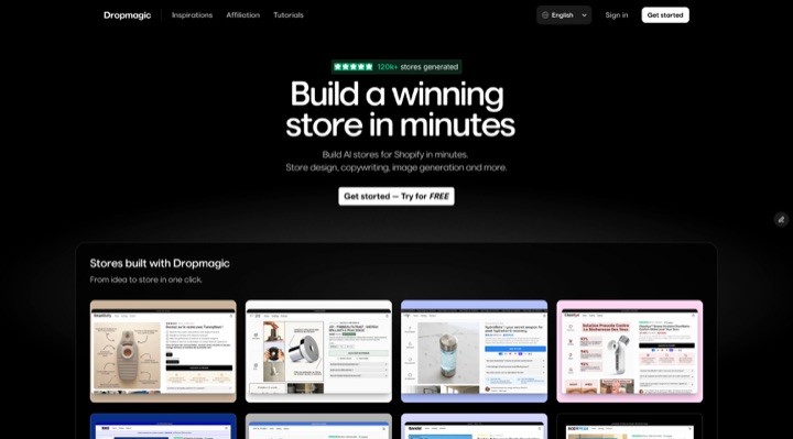
Dropmagic: The leading ai store builder for Shopify — generate a complete, branded store in minutes with AI-driven copy, multilingual support, and 50+ conversion sections.
Storebuild ai: A niche-focused shopify ai store builder that preloads 10 products and optimizes design for conversions. Read our full comparison →
Buildyourstore ai: Same logic as above but more limited. Read our full comparison →
Shopify Magic: Shopify's built-in AI suite for content creation, customer segmentation, and real-time store insights. Read our full comparison →
PagePilot: Creates high-converting product pages and Facebook ads in seconds — a popular shopify store builder for dropshippers. Read our full comparison →
Shogun: No-code page builder with AI tools for design, SEO, and A/B testing, ideal for advanced customization.
PageFly: Flexible drag-and-drop builder with over 120 templates and CRO-focused features.
Atlas AI Store Builder: Launches fully functional stores in under 2 minutes with market research, bundling, and upsell tools. Read our full review →
Looking for a complete ranking? Check out our Best AI Shopify Store Builders 2026 pillar guide.
Quick Comparison
Tool | Focus | Setup Time | Key Features | Pricing | Best For |
|---|---|---|---|---|---|
Dropmagic | Full store automation | Minutes | AI branding, multilingual, 50+ sections | Free trial, custom pricing | Time-saving automation |
Niche store creation | Minutes | Preloaded products, SEO content, customization | Free store, Shopify fees | Beginners testing niches | |
Shopify Magic | Shopify integration | Instant | Text/image generation, real-time insights | Included in Shopify plans | Existing Shopify users |
PagePilot | Conversion focus | Seconds | Product pages, ad copy, A/B testing | Varies by features | High-conversion dropshipping |
Shogun | Advanced customization | Moderate | Drag-and-drop, A/B testing, mobile optimization | Tiered pricing | Design-focused stores |
PageFly | Design flexibility | Flexible | Templates, visual editor, A/B testing | Freemium model | Custom design needs |
Atlas AI | Rapid deployment | Under 2 minutes | Single-link store creation, market research, bundling tools | $29–$99/month | Quick product testing |
These tools cater to different needs — from full automation and speed to advanced design and customization. Whether you're a first-time seller looking for a free ai shopify store builder or scaling an existing business, there's an AI tool here to match your goals.
Best AI E-Commerce Store Builders 2026 — Top AI Tools to Launch Your Online Store Fast
1. Dropmagic
Dropmagic is the most complete ai store builder for Shopify — an AI-powered platform that removes every technical hurdle between you and a professional online store. Instead of spending days on themes, copy, and branding, Dropmagic handles it all in minutes. It's quickly become the go-to shopify ai store builder for U.S. entrepreneurs who want speed without sacrificing quality. If you're wondering how to build your store ai-first, Dropmagic is the answer.
Store Setup Speed
With Dropmagic, you can turn a product URL into a fully branded Shopify store in less than five minutes. According to Shopify, the average merchant spends 2–4 weeks building a store manually. The platform automates key tasks like writing product descriptions, designing store layouts, creating branding, and generating product images. For example, on May 20, 2025, Lucas D. shared:
"Launching a full store in 12 minutes using Dropmagic, without touching a theme, writing any copy, or installing any apps"
The platform claims to reduce store launch times by a factor of 10, with over 2,300 stores already created. This speed doesn't come at the expense of quality — users can still customize their stores extensively.
Customization Options
While automation is a key feature, Dropmagic also offers extensive customization tools. Entrepreneurs can choose from over 50 conversion-focused sections, allowing them to tweak their store's design without starting from scratch. According to the Baymard Institute, 70% of shoppers abandon carts due to poor UX — Dropmagic's visual editing tools make it easy to adjust layouts, branding, and product presentations for maximum conversions. As Thomas V. put it:
"I've spent weeks on themes before. Dropmagic did it in minutes."
This blend of speed and flexibility ensures that stores not only launch quickly but also stand out with a polished, professional look.
AI-Driven Features
Dropmagic leverages advanced AI to enhance eCommerce performance. Its AI-powered copywriting tool is trained on successful brand strategies, drawing insights from 8-figure businesses to craft compelling product pages and headlines. Other standout features include:
One-click product imports from platforms like AliExpress, Amazon, and Alibaba
Automatic branding creation
Multilingual copy generation
Mobile-first designs for a seamless customer experience
In one test, Jules K. reported:
"A/B tested against my old theme… Dropmagic converted +22% better"
As a shopify store builder, Dropmagic stands out because it replaces an entire stack of tools — copywriting, theme design, branding, cart optimization — in a single platform.
Relevance for U.S. eCommerce Entrepreneurs
Dropmagic doesn't just save time — it replaces multiple tools, including those for copywriting, theme design, branding, and cart management. According to Statista, U.S. ecommerce sales are projected to surpass $1.4 trillion by 2027, making speed-to-market a critical competitive advantage. This reduces both setup costs and ongoing operational challenges. For instance, Mehdi K. highlighted this on April 20, 2025:
"I tested 4 products in one week with Dropmagic, built 4 stores, and found a winner"
If you're looking for an ai shopify store builder free to start with, Dropmagic offers a free trial so you can build my store ai-powered without any upfront commitment.
2. Storebuild ai
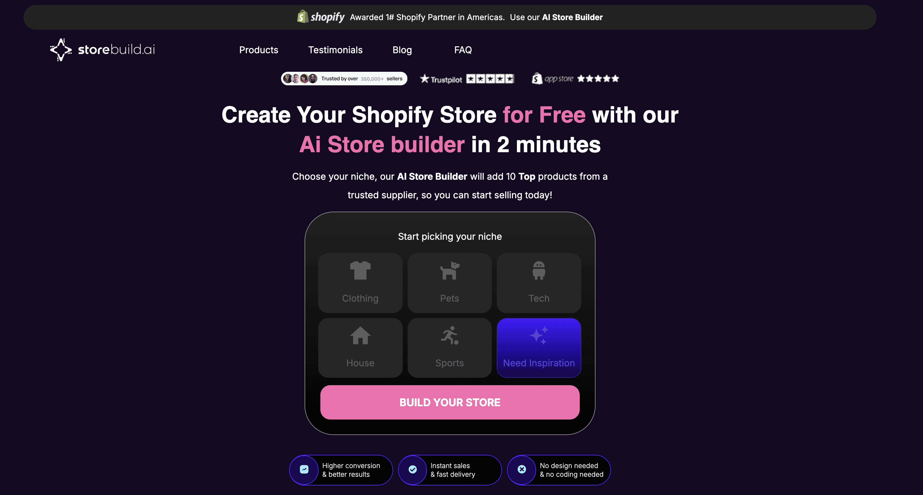
Storebuild ai is an ai store builder designed for entrepreneurs looking to break into niche markets. It simplifies the process by helping users select a niche and then builds a fully functional Shopify store in just a few minutes. Instead of starting from scratch, the platform walks users through choosing a niche, after which its AI handles the heavy lifting to create a complete store setup.
Want a detailed comparison? Read our Storebuild ai vs Dropmagic breakdown. Or read our full Storebuild.ai review.
Store Setup Speed
One of the standout features of Storebuild ai is how quickly it sets up an online store. After selecting a niche, the AI not only builds the store but also preloads it with 10 carefully chosen products, setting the stage for instant sales opportunities. This fast deployment ensures users can hit the ground running, with further AI tools available to refine and enhance their store as needed.
AI-Driven Features
Storebuild ai goes beyond just creating a store — it leverages AI to optimize design and generate content that's ready to perform. Its AI capabilities include:
Automated Product Curation: The platform selects and loads 10 top-performing products tailored to the chosen niche.
SEO-Optimized Content Generation: It creates product descriptions that are not only engaging but also optimized for search engines, helping boost visibility and conversions.
Conversion-Focused Design: Users receive a custom theme designed specifically to drive sales and improve user experience.
Customization Options
Despite its automated setup, Storebuild ai offers users full control over their stores. Entrepreneurs can tweak every aspect, from adding new products to customizing the design and integrating additional tools. This flexibility allows users to maintain their brand identity while benefiting from the AI's foundational work. Importantly, users retain 100% ownership of their stores and keep all profits.
Relevance for U.S. eCommerce Entrepreneurs
For American entrepreneurs, Storebuild ai solves the challenge of getting to market quickly. With over 228 people in the U.S. making their first sale daily, the platform is especially useful for beginners seeking to test and validate their ideas fast. Its high user satisfaction is reflected in a 4.8-star rating across more than 9,000 reviews on Shopify and TrustPilot.
The pricing model is another major draw for U.S. entrepreneurs. The AI-built store itself is free — users only need to cover Shopify's standard hosting fees. Additionally, through a partnership with Shopify, new users can take advantage of a 3-day free trial and pay just $1 for their first month. As a free ai shopify store builder option, it's hard to beat for beginners. The platform automates order fulfillment and product sourcing, allowing entrepreneurs to focus on marketing and growing their customer base instead of dealing with operational tasks.
3. Shopify Magic
Shopify Magic is a collection of free, AI-powered tools built right into Shopify's platform. As a native shopify ai store builder feature, it helps merchants manage everything from building their stores and marketing to handling customer support — all without relying on multiple third-party solutions.
See how it stacks up: Shopify Magic vs Dropmagic full comparison.
AI-Driven Features
Shopify Magic brings automation to several aspects of eCommerce. For example, its text generation tools can create product descriptions, email subject lines, blog posts, and other SEO-friendly content in seconds. The media generation feature allows merchants to remove or replace image backgrounds, making it easy to produce professional-looking product photos. Plus, with theme generation, users can design personalized store layouts and custom theme blocks by simply typing in text prompts.
The platform also includes an AI assistant called Sidekick, which provides real-time insights and recommendations. Sidekick can handle technical tasks like setting up domains or managing metafields, making it easier for merchants to focus on growing their business. These features not only simplify content creation but also speed up the overall store setup process.
Faster Store Setup
By automating repetitive tasks, Shopify Magic makes it quicker to get an online store up and running. Merchants can generate polished content and tweak designs in no time. The system also breaks down customer segments into easy-to-understand descriptions and provides summaries of app reviews, helping merchants choose the right tools for their store. This efficiency fits perfectly with Shopify's broader goal of streamlining eCommerce operations.
Flexible Customization
While Shopify Magic automates many processes, it also allows for customization. Merchants can edit AI-generated content to match their brand's tone and style. The integrated theme editor and keyword-focused text tools provide additional options for fine-tuning designs and improving SEO, giving businesses the flexibility to stand out.
A Boost for U.S. eCommerce Entrepreneurs
Shopify Magic is particularly well-suited for U.S.-based merchants. It defaults to American English and draws on language data from North America to ensure the content connects with U.S. customers. Take Klatch Coffee, for example — a family-owned roastery that switched to Shopify to take advantage of these AI tools. By automating everyday tasks, they've been able to focus more on strategic growth.
However, Shopify Magic works best as an add-on to an existing Shopify plan rather than a standalone ai store builder. If you need a tool that generates a complete store from scratch — theme, copy, branding, and all — a dedicated shopify store builder like Dropmagic may be a better fit.
4. PagePilot
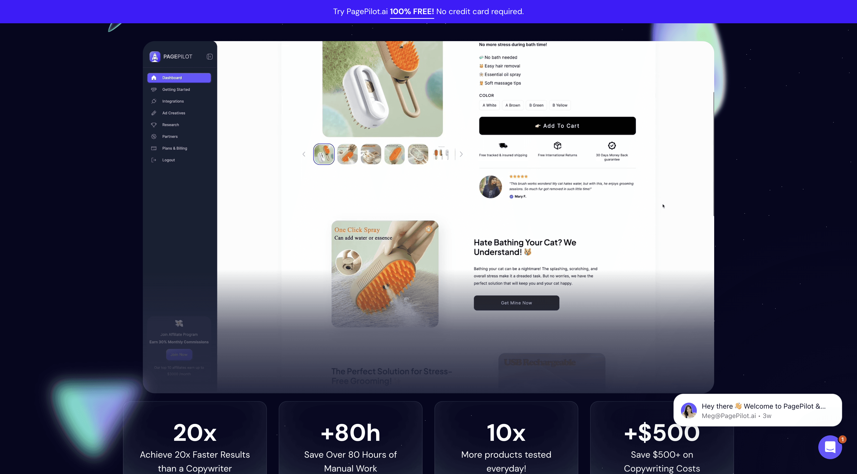
PagePilot is an AI-powered shopify store builder designed to create high-converting product pages and Facebook ads directly from AliExpress or Shopify product links.
Read the full breakdown: PagePilot vs Dropmagic comparison.
Store Setup Speed
With PagePilot, you can publish a product page in just 60 seconds. Compare that to the roughly 3 hours it takes to do it manually, and you're saving over 80 hours while cutting copywriting costs from $50 to just $0.78 per product page.
"I was able to launch my store within a day and test multiple products quickly while my competitors are still working on their website. Best AI Shopify store builder." – Vinish P.
This speed advantage pairs perfectly with its advanced AI features.
AI-Driven Features
PagePilot uses AI to automate content creation and optimize product information from AliExpress or Shopify links. It builds detailed, sales-focused pages that include reviews, product variants, guarantees, and optimized images. The platform applies proven copywriting techniques to craft engaging product descriptions and Facebook ad copy that drive results. One standout feature is the one-click import to Shopify stores, which lets you add the generated product page instantly — no extra formatting needed.
Customization Options
PagePilot supports customization by generating product pages in over 30 languages. It also offers adjustable fonts and styling to align with preferences specific to U.S. audiences.
Relevance for U.S. eCommerce Entrepreneurs
For entrepreneurs in the U.S., PagePilot is a popular choice. According to WordStream, the average Facebook ad conversion rate across industries is 9.21%, but well-optimized product pages can push that significantly higher. PagePilot allows you to test multiple products in the time it would normally take to create just one product page.
"PagePilot.ai transformed my business! My sales skyrocketed with its high-converting pages. This tool is a must-have for any dropshipper." – Anthony Eclipse
That said, PagePilot focuses on individual product pages rather than full store creation. If you want a complete ai store builder that handles everything from branding to store layout, check out how PagePilot compares to Dropmagic.
5. Shogun
Shogun is a no-code page builder designed for major eCommerce platforms. With its drag-and-drop interface and AI-powered tools — like AI Text, Designer, SEO, and Elements — it enables users to create high-converting store pages without needing technical expertise. While not a full ai store builder in the same sense as Dropmagic or Atlas, it's a powerful design tool for merchants who want granular control.
AI-Driven Features
In September 2023, Shogun introduced four AI tools to simplify content creation. AI Text helps generate optimized copy for product and landing pages, while AI Designer turns simple prompts into webpage sections. The AI SEO tool automatically crafts meta titles and descriptions, and AI Elements creates custom code for interactive components.
"You can now generate content — from your store's copy to entire page sections — instantly. Now, you never need to start from a blank page." – Bill Farrell, Senior Director of Product Management at Shogun
Additionally, Shogun Insights provides real-time tips to enhance conversions and design, allowing merchants to predict how their content will perform without external testing. These features make customization straightforward and effective.
Customization Options
Shogun's drag-and-drop editor makes it easy to add images, videos, buttons, and forms, while letting you tweak fonts, colors, and layouts to align with your brand. Pre-built templates are available as a starting point for further customization.
The platform also supports advanced personalization, enabling you to tailor content for different audience segments. Businesses have seen tangible results with these features. For example, LogoJET Inc. used Shogun to create custom pages beyond Shopify's default templates.
Store Setup Speed
Shogun eliminates the frustration of starting from scratch by letting users generate entire page sections instantly with its AI tools. The drag-and-drop functionality further speeds up the process, allowing users to create professional-looking pages much faster than traditional coding.
Relevance for U.S. eCommerce Entrepreneurs
For U.S. entrepreneurs, Shogun offers unique advantages. It's the only page builder with Shopify Plus certified status, making it an excellent choice for scaling businesses. According to Insider Intelligence, mobile commerce accounts for over 44% of U.S. eCommerce sales, making Shogun's mobile optimization features particularly vital.
Businesses using custom landing pages report conversion rates up to 40% higher than those relying on standard templates. Some Shogun users have achieved up to a 15% boost in conversions through A/B testing.
"When it comes to strategic ecommerce expansion, you need solutions that can handle complexity." – Finbarr Taylor, Co-founder and CTO of Shogun
Shogun consistently earns high marks from users, with Capterra reviews averaging 4.8/5 stars.
6. PageFly
PageFly is a drag-and-drop shopify store builder designed specifically for Shopify stores, trusted by over 200,000 merchants worldwide. Its primary focus is on conversion rate optimization (CRO) and offering flexible design tools, making it easy for entrepreneurs to create custom landing pages, product pages, and homepages — no coding required.
Customization Options
PageFly's editor gives you complete control over your page designs. You can tweak every detail, from layouts and advanced styling to integrating seamlessly with most Shopify themes, all without altering your core theme assets. With access to over 120 templates and compatibility with more than 130 apps, it provides plenty of tools to help you build a standout online store.
What sets PageFly apart is its ability to create pages with fully customizable elements, going beyond Shopify's usual design options. This flexibility has led to tangible results for many users. Craig Hume, Managing Director of Utopia Computers, shared:
"PageFly has been a game changer for our online presence."
Amaury Abel-Smith, Owner of Lock Feet, also praised the platform:
"PageFly has given me all resources to craft a really beautiful website that drives more sales."
Store Setup Speed
PageFly doesn't just offer customization — it also speeds up the entire store setup process. Its pre-designed templates and drag-and-drop interface make it easy to build professional-looking pages quickly. You can implement changes in real-time, skipping the delays that often come with custom development.
Why It Matters for U.S. eCommerce Entrepreneurs
For U.S.-based entrepreneurs, PageFly's combination of design flexibility and speed is a major asset. The platform offers 24/7 customer support and A/B testing tools, enabling users to make data-driven improvements to their stores. With a stellar reputation — boasting a 4.9/5 rating on the Shopify App Store and a 4.8/5 score on Trustpilot — PageFly is known for its ease of use and powerful design features.
Pricing is straightforward: there's a free plan (one published page) and paid options ranging from $24/month (up to 5 pages) to $99/month (unlimited pages). Note that PageFly is a page builder, not a full ai store builder — it won't generate your branding, copy, or product imports automatically the way a dedicated shopify ai store builder like Dropmagic does.
7. Atlas AI Store Builder
The atlas ai store builder is an AI-powered shopify store builder that simplifies store creation like never before. With over 45,234 stores launched and more than $22,273,566 in user sales, it's a serious player in the ai store builder space.
Read our in-depth Atlas AI Store Builder Review.
AI-Driven Features
The atlas ai store builder takes automated store creation to the next level. It can create a fully functional Shopify store from a single product link — whether from AliExpress, Amazon, Alibaba, or Shopify itself. Beyond just building the store, the AI handles market research, generates professional-grade product descriptions, and crafts persuasive copy designed to convert visitors into buyers. It even produces high-quality product photos, eliminating the need for costly design work. The atlas.ai store builder also includes built-in bundling and upsell tools to help increase average order values.
Store Setup Speed
Speed is one of the atlas ai store builder's standout qualities. The platform can build a complete Shopify store in an average of just 1 minute and 57 seconds. This lightning-fast setup allows entrepreneurs to quickly test new product ideas and launch stores without delay, making it perfect for those who want to validate concepts in record time.
Customization Options
While automation is at the heart of the atlas ai store builder, it doesn't skimp on customization. Users can choose from over 30 customizable theme sections and widgets, giving them the ability to tweak store names, product titles, pricing, ratings, and descriptions to match their brand identity. Once the store is generated, it remains fully editable within Shopify, allowing changes to text, colors, layouts, and more. Their "Bolt" premium theme is well-designed and serves as a flexible foundation.
Relevance for U.S. eCommerce Entrepreneurs
The atlas ai store builder is particularly well-suited for entrepreneurs in the U.S., addressing key challenges like the need for quick market entry and the high costs of hiring freelancers for design and copywriting. By combining multiple functions into a single platform, it can help save significant costs per store launch. Its seamless integration with Shopify ensures a smooth user experience, and its strong reputation is reflected in a 4.6/5 rating on the Shopify App Store, with 89% of users giving it 5 stars.
Pricing is straightforward: $29/month for 50 credits (Basic), $49/month for 150 credits (Pro), and $99/month for 450 credits (Expert). Store generation uses 10 credits, while creating individual product pages costs 2 credits each. For a deeper look at how Atlas compares, read our Atlas AI vs Dropmagic analysis.
Feature and Price Comparison
Here's a quick look at how these ai store builder tools stack up in terms of features, setup time, and pricing:
Tool | Primary Focus | Setup Time | Key Features | Pricing | Best For |
|---|---|---|---|---|---|
Dropmagic | Complete store automation | Minutes | AI copywriting, 50+ conversion sections, multilingual support, instant branding | Free trial available, pricing on request | Entrepreneurs seeking full automation |
AI-powered store building | Fast setup | Automated store creation, product import, basic customization | Custom pricing | Rapid store launches | |
Shopify Magic | Native Shopify integration | Instant | Built-in AI tools, seamless workflow, automatic optimization | Included with Shopify plans | Current Shopify users |
PagePilot | Page optimization | Quick implementation | Landing page creation, conversion optimization, A/B testing | Pricing varies by features | Stores focused on conversion rates |
Shogun | Advanced customization | Moderate setup time | Drag-and-drop builder, A/B testing, detailed design controls | Tiered pricing structure | Design-focused stores |
PageFly | Design flexibility | Flexible setup | Extensive templates, visual editor, mobile optimization | Freemium model | Custom design needs |
Atlas AI Store Builder | Ultra-fast deployment | Under 2 minutes | Single-link store creation, market research, bundling tools | $29–$99/month | Quick testing and validation |
This table highlights the differences in speed, customization, and cost, helping you choose the shopify ai store builder that aligns best with your business goals.
If speed is your priority, the atlas ai store builder stands out with its sub-two-minute setup, perfect for businesses needing rapid testing. Similarly, Dropmagic offers a quick deployment process, taking only a few minutes. On the other hand, tools like Shogun and PageFly cater to users who need advanced customization, offering drag-and-drop builders and extensive design flexibility for unique branding and layouts. For entrepreneurs who prefer automation with essential customization, Dropmagic and Atlas AI provide built-in editors that balance ease of use with functionality.
When it comes to pricing, Dropmagic offers a free trial — making it an ai shopify store builder free to try — while Shopify Magic includes its AI features as part of existing Shopify plans, simplifying the cost for current users. For U.S.-based businesses, Shopify's native integration streamlines crucial aspects like currency, tax, and shipping setup.
Ease of use varies widely. Fully automated platforms like Dropmagic and Atlas AI require little to no technical know-how, making them great for solopreneurs or small teams. In contrast, tools like Shogun demand more design expertise but reward users with greater control over the final product.
Each tool brings unique strengths to the table. Dropmagic's 50+ conversion-focused sections and multilingual support are perfect for businesses aiming to reach global audiences, while Atlas AI's bundling tools help boost revenue per customer. Ultimately, the right shopify store builder depends on your specific needs and the level of customization and automation your business requires.
Still unsure? Our Best AI Shopify Store Builders 2026 guide ranks every tool side-by-side with a detailed comparison table.
Final Thoughts
The data speaks volumes: according to McKinsey, 60% of small businesses using AI or automation report saving time and working more efficiently, while companies leveraging AI have seen an average revenue boost of 10–12%.
The rise of AI-powered ecommerce solutions is part of a larger shift. According to IBM, in 2024, 40% of small businesses reported using generative AI — almost double the figure from the previous year. This rapid adoption is fueled by clear, measurable benefits.
The impact is evident in practical examples. A furniture retailer using Google Cloud's PaLM 2 reduced its content creation workload by up to 75%, saw a 25% improvement in product visibility, and experienced a 20% increase in conversion rates (Google Cloud case studies). Similarly, DoggieLawn's transition from Magento to Shopify Plus, powered by AI, led to a 33% increase in conversions by 2025.
Other success stories highlight how AI is reshaping ecommerce. Ilia's AI-driven shade-matching quiz attracted a waitlist of 55,000 shoppers before a product launch, while Olive & Piper used AI-based personalization to achieve a 35% boost in conversions during peak shopping seasons. These examples show how the right ai store builder can directly translate into business growth.
"Automate what can be automated. Don't be afraid to leverage generative AI tools as an aide to get things done more efficiently and effectively. Remember that your team's time is valuable; focus on what you're uniquely qualified to do and outsource the rest." — Steven Gmelin, VP of Digital Sales and Strategy at ALOHA
AI tools now give small businesses access to capabilities once reserved for large corporations. From dynamic pricing to inventory management, these tools are game-changers. According to Harvard Business Review, businesses using predictive analytics have reported up to a 75% reduction in stockouts and a 20% decrease in inventory carrying costs.
For U.S. entrepreneurs, the competitive edge is undeniable. According to Accenture, AI is expected to boost profitability by 59% by 2035, and AI-driven automation could increase ecommerce profitability by 15–20% by 2030. Early adopters who invest in the right shopify store builder are positioning themselves for long-term success. If you want to build your store ai-powered, the tools discussed here are just the start of what AI can do for ambitious entrepreneurs.
Chris Wlezien, Founder & Product Innovation Strategist at Eureka Partners, offers this advice:
"Allow yourself the freedom and flexibility to try a variety of tools regularly, and give yourself the space to learn them and even sometimes fail. AI tools are being created so rapidly and have so much power but also many shortcomings, which are hard to anticipate, so experimenting and allowing yourself to be curious and try a variety of tools is really the foundation to being successful in this rapidly growing landscape."
With some AI tools starting at under $200 per month, small businesses in the U.S. can quickly test and integrate these technologies without significant upfront costs. This low barrier to entry, combined with the efficiency and performance gains, makes an ai store builder an accessible and powerful ally for entrepreneurs looking to scale their operations.
FAQs
What is an AI store builder and how does it help with ecommerce?
An ai store builder is a platform that uses artificial intelligence to automate the process of creating an online store — from generating product descriptions and branding to designing layouts and optimizing for conversions. According to Shopify, merchants using AI tools launch stores up to 10x faster than those building manually. Instead of spending weeks building a shopify store builder theme, these tools let you launch a professional store in minutes. They're especially useful for dropshippers and solo entrepreneurs who want to test products fast without hiring designers or copywriters.
What should I look for when selecting an AI Shopify store builder?
When selecting a shopify ai store builder, start by ensuring it works well with your current platform and tools. A smooth integration can save you time and prevent headaches down the road. You'll also want to choose a tool that can grow with your business — whether that means handling more traffic, managing higher transaction volumes, or scaling other operations.
Pay attention to features that can simplify your workload, like automated product uploads, marketing tools, and customer support options. If you're new to AI, prioritize tools that are easy to use and don't require a steep learning curve. According to the NNGroup, pages that load in under 3 seconds see 53% lower bounce rates — so check that your builder produces fast-loading stores. The right ai store builder can make the process of building your store smoother and set you up for success as your business grows.
Is there a free AI Shopify store builder I can start with?
Yes — several platforms offer free trials or free tiers. Dropmagic is an ai shopify store builder free to try with its free trial, letting you build your store ai-powered before committing. Storebuild ai also offers an ai store builder free option where the AI-built store itself is free and you only pay Shopify's standard hosting fees. Shopify Magic is included at no extra cost with any Shopify plan. The key is to start building, test what works, and upgrade as your business grows.
How does the Atlas AI store builder compare to Dropmagic?
The atlas ai store builder focuses on ultra-fast deployment — creating a complete Shopify store in under 2 minutes from a single product link. It's ideal for rapid product testing with built-in bundling and upsell tools. Dropmagic takes a more comprehensive approach, generating full branding, AI-powered copy trained on 8-figure brand strategies, and 50+ conversion sections. For a detailed side-by-side breakdown, see our Atlas AI vs Dropmagic comparison and our full Atlas AI Store Builder Review.
Can I build my store AI-powered if I have no technical skills?
Absolutely. The whole point of an ai store builder is to remove the technical barrier. Platforms like Dropmagic and the atlas ai store builder require zero coding knowledge — you simply provide a product URL or choose a niche, and the AI generates everything from branding and product descriptions to store layout. According to Grand View Research, the no-code AI tools market is growing at 28.1% CAGR, driven by demand from non-technical entrepreneurs. If you want to build my store ai-first, these tools make it possible in minutes.
Which AI store builder is best for dropshipping beginners?
For beginners, the best ai shopify store builder depends on your budget and goals. If you want a completely ai store builder free option to start, Storebuild ai lets you create a store at no cost beyond Shopify fees. For a more feature-rich launch, Dropmagic's free trial gives you access to 50+ conversion sections, AI branding, and multilingual copy — helping you build your store ai-first with professional quality. Once you're ready to scale, you can explore tools like PagePilot for high-converting product pages or Shopify Magic for native Shopify AI features.


